While working at Capital One, our team partnered with the Venture Capital division to streamline some of their processes. The Venture Capital team is constantly searching for emerging companies and technologies to research, evaluate, and invest in. However, they relied on decentralized spreadsheets and email chains to keep track of complex evaluation processes that hinged on many different parts of the company. Thus, they tasked our team to create a new platform that would provide a hub to keep track of and consolidate the technology evaluation process .
I was the sole product designer in addition to being the main front-end developer. Due to resource and time constraints, we were unable to work with a dedicated design team, so it was a challenging and exciting opportunity for me to bring the product from research -> conceptualization -> a fully functional product.
4 people (1 designer/engineer, 2 engineers, 1 product owner)
Due to the sudden prioritization of the project, we only had a week to show an initial design and prototype,
so we conducted a condensed research phase.
Stakeholders from different parts of the company were interviewed to pinpoint our core features revolving
around 3 types of
users.
User 1: The Venture Team Member
The Venture team member is the primary user of our product. They are the ones creating evaluations and bringing them through the different approvals required. At all times they need to see what stage an evaluation is in and the steps required to advance it. In the interview, they explained that most of their information was stored in google forms and spreadsheets, so we first explored if there were ways to enhance their existing workflow without creating an entirely new product. We agreed that they would benefit from a more customizable dashboard, and a workflow that was easier to share and follow.
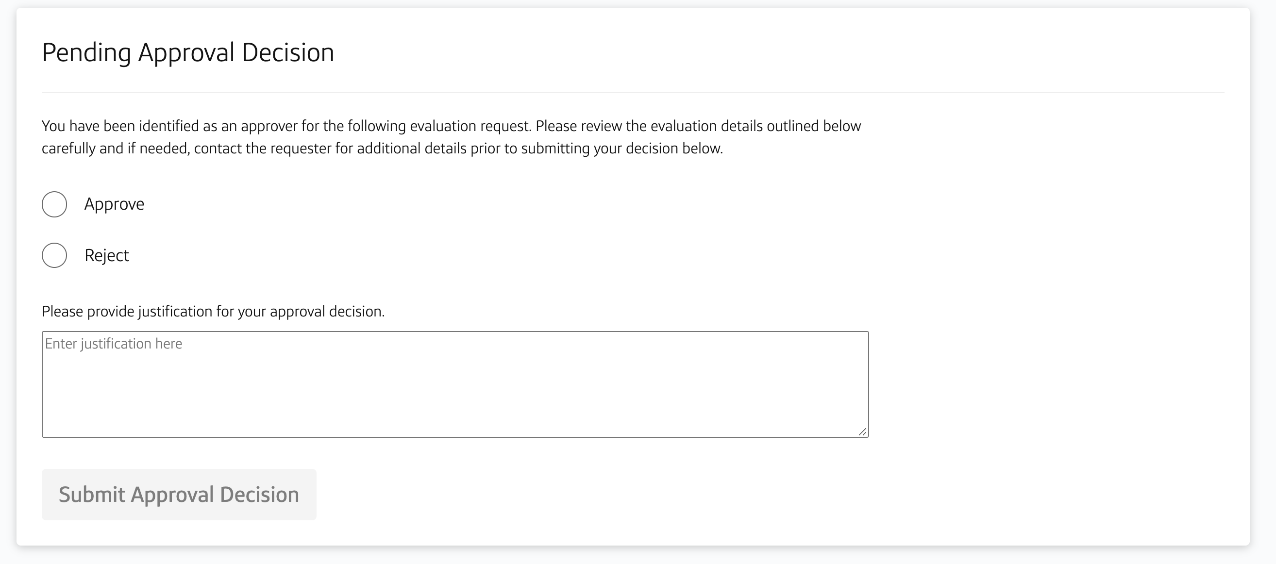
User 2: The ApproverThe evaluation needs to jump through various hoops to be approved at the company level, so certain stakeholders are responsible for signing them off at various stages. The approver should be notified when they need to take action, have a centralized place to find their assignments, submit documentation, and approve or reject an evaluation.
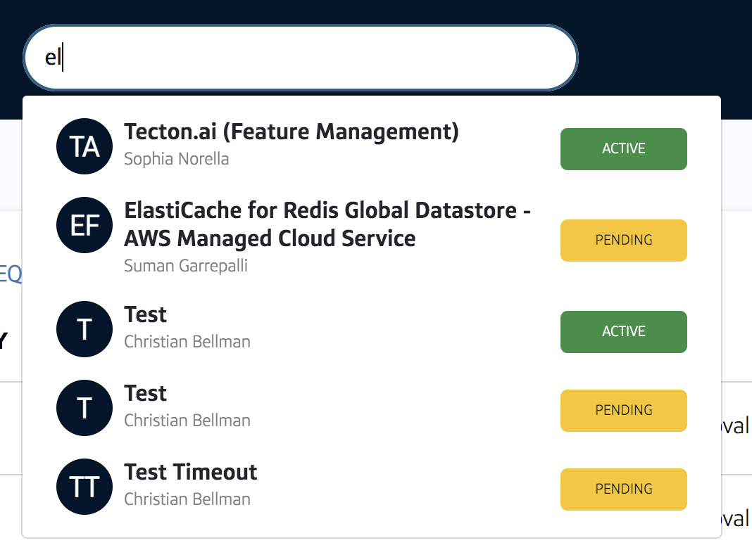
User 3: The Everyday ObserverLastly, there are employees at the company who are not directly involved with the Ventures team but are curious about the status of evaluations or have evaluations they would like to recommend themselves. It’s important for them to be able to search for existing evaluations, browse the catalog of technologies, and potentially request evaluations.
The evaluation process had historically been obscured behind disparate spreadsheets, leaving many in the
dark
about the state of evaluations at the company.
We found that transparency and clarity were the most important aspects for our users.
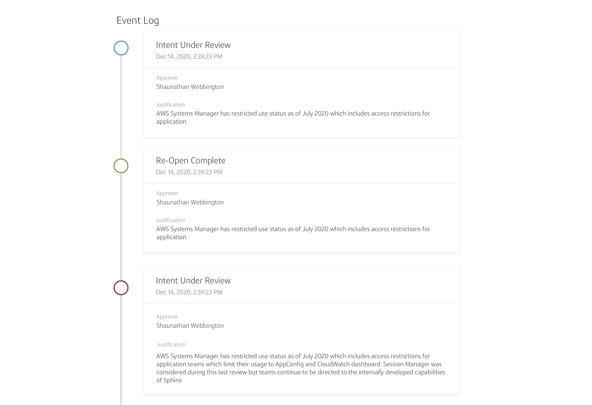
One of the most important takeaways from the interviews is how important it was to keep a history of the entire evaluation process. That way, they knew which key people were involved, why something was approved or rejected, and provide transparency into an otherwise inaccessible process.
Mockups and user flows were created using Sketch, Invision, and Capital One's internal design system.
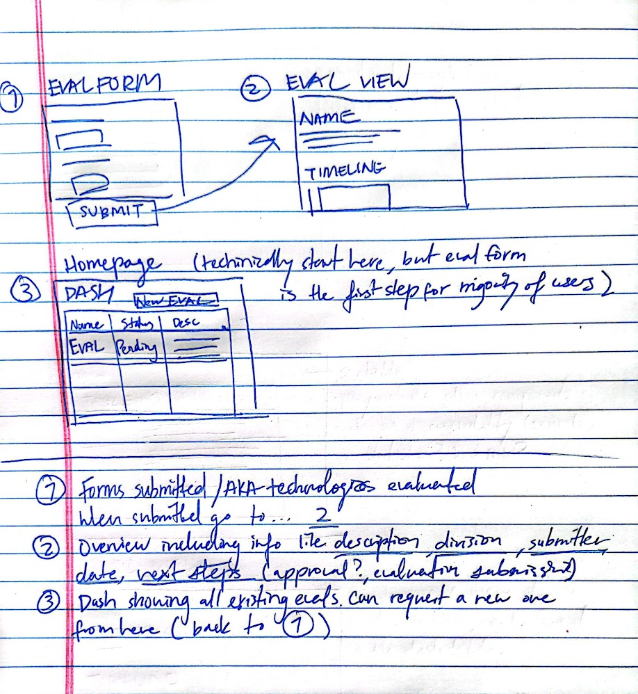
Accounting for the quick turnaround required, we wanted to focus on the core features - an evaluation request form, a dashboard, and an evaluation timeline page.
Wireframes for our starting 3 pages:
1. The evaluation intake form where our Venture team can kick
off the
process by inputting the details (replacing the Google form used prior)
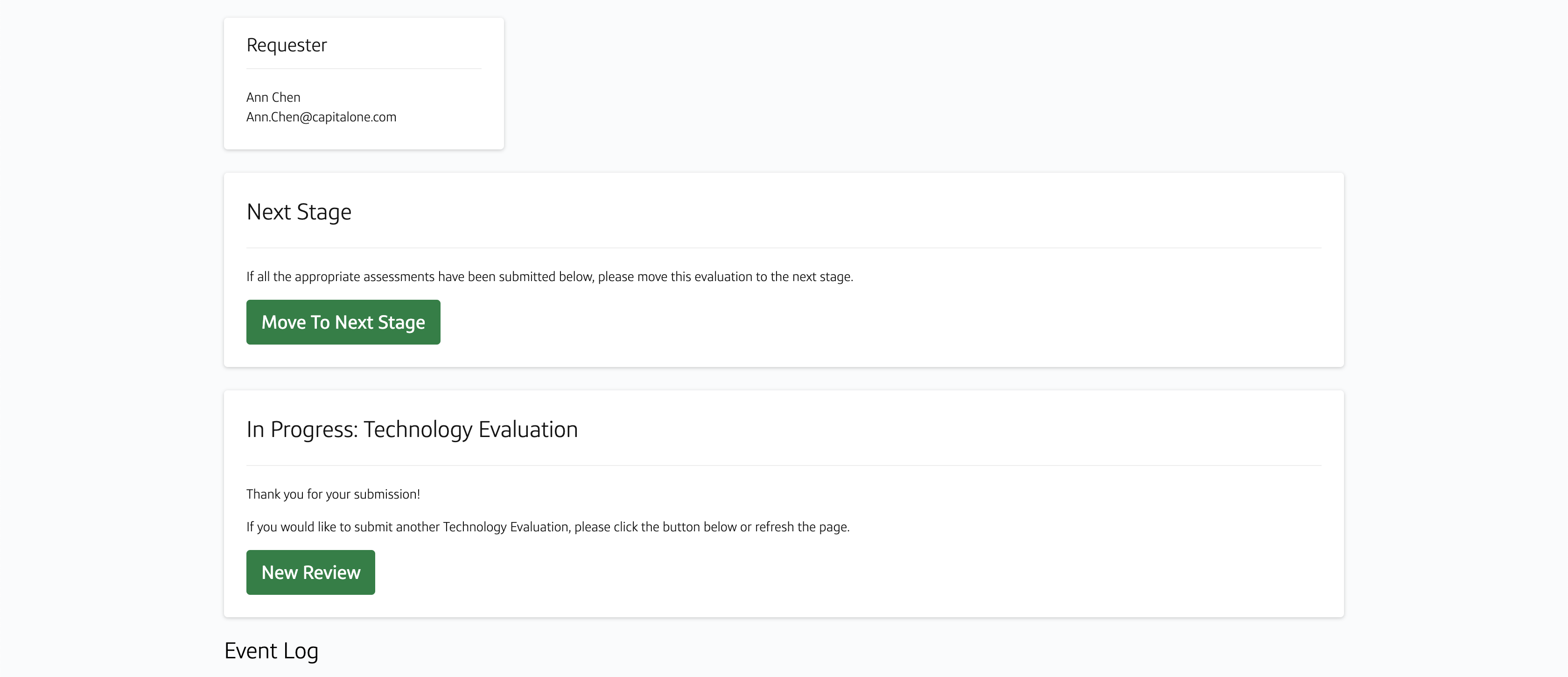
2. The details page for a single
evaluation, including the steps the evaluation has gone through.
3. The dashboard/home page where all
evaluations and their statuses can be viewed.
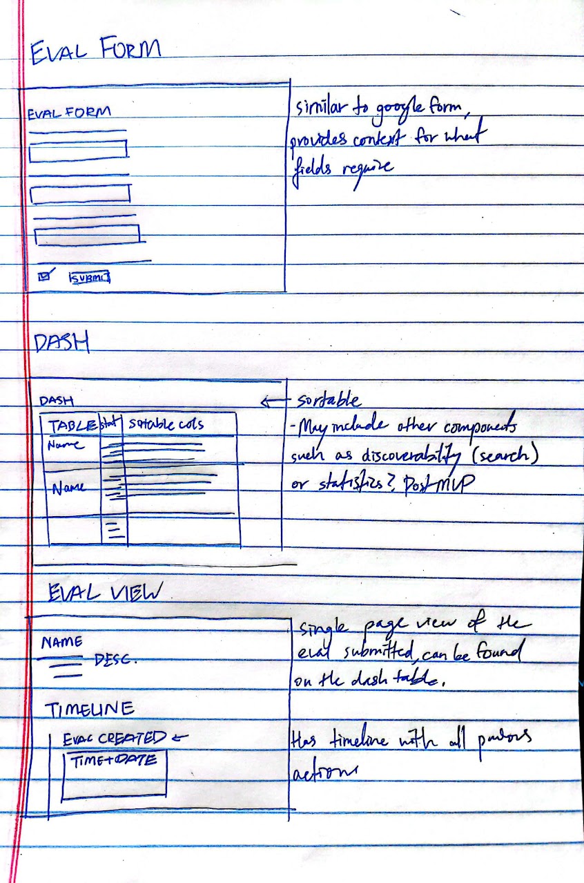
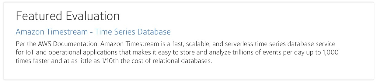
For the designs, we stuck to a simple interface leveraging the existing Capital One design language combined with tools our users were used to (i.e. Google Forms and Sheets). All images below are shown with test data on the development site, so please disregard any odd naming conventions.
Home/Dashboard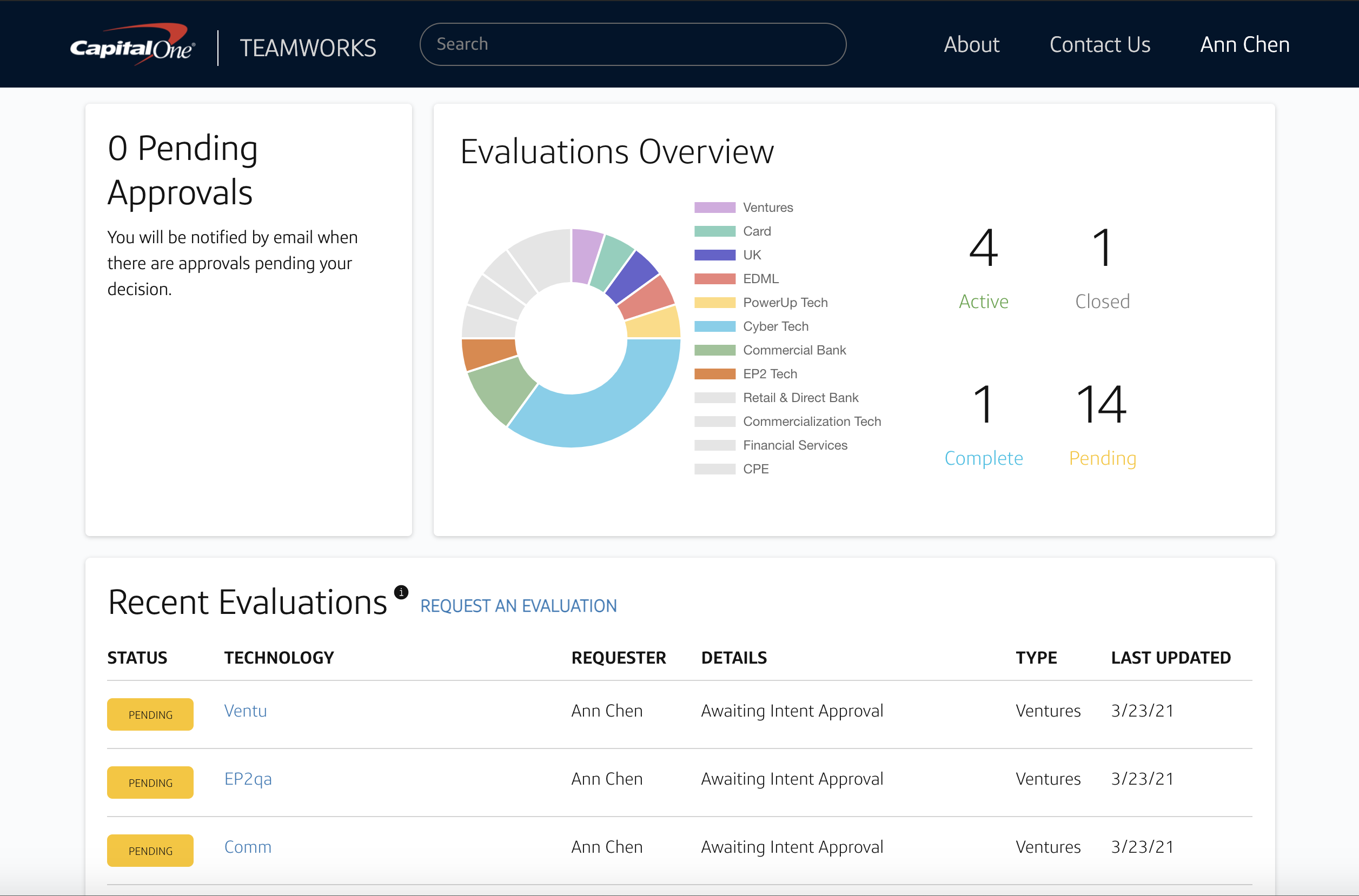
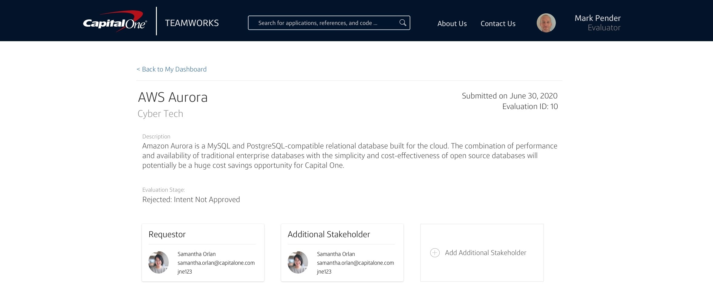
The Venture team fully onboarded their portfolio onto our platform and used it to track technologies daily. A few months in, we had around 40-50 active evaluations and the team was happy with the centralized tool. Outside of the Venture team, other users expressed curiosity and interest in the company's investment and integration strategies.
Considering the very short timeline, I was proud of what our team was able to accomplish. Functionality was definitely prioritized in this MVP - given more resources I would have liked to do more user testing and iterations based on continuous feedback. Ideas for further improvements included having more ways to filter the evaluations as well as a clearer timeline with animations similar to what you might see in a live deployment / pipeline tool.