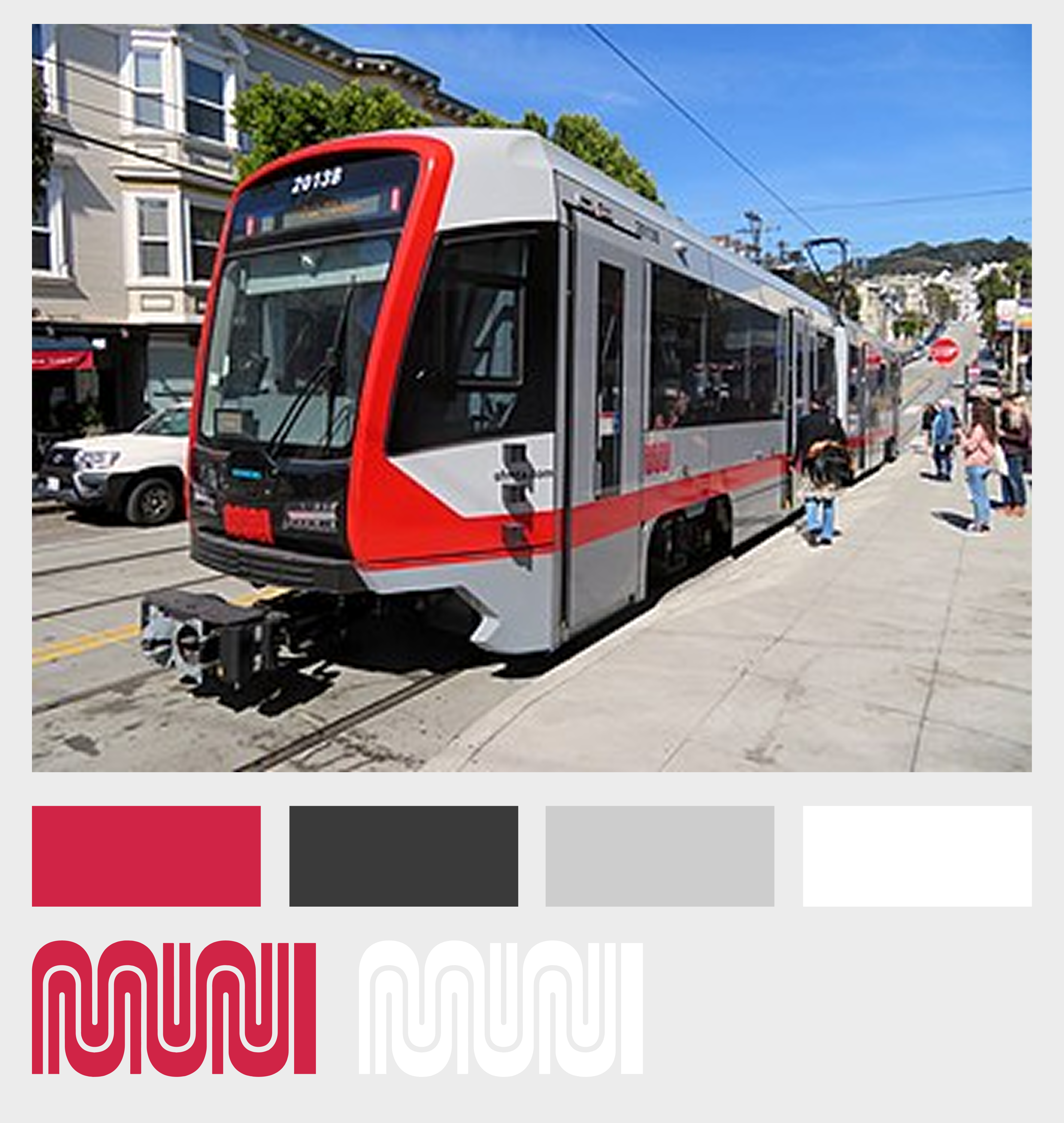
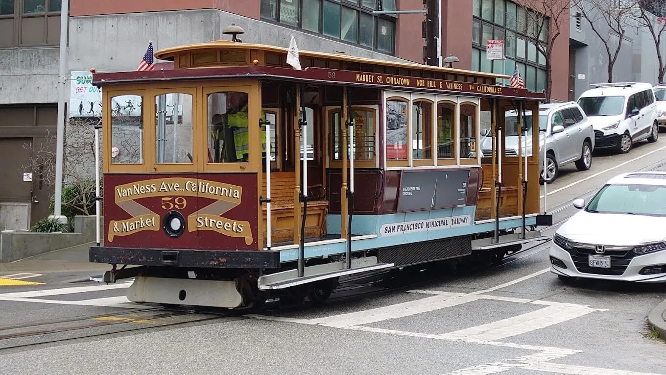
Muni is San Francisco’s primary public transit system - a chaotic mix of buses, light rail trains, and iconic cable cars that serves around 500,000 commuters and visitors daily.
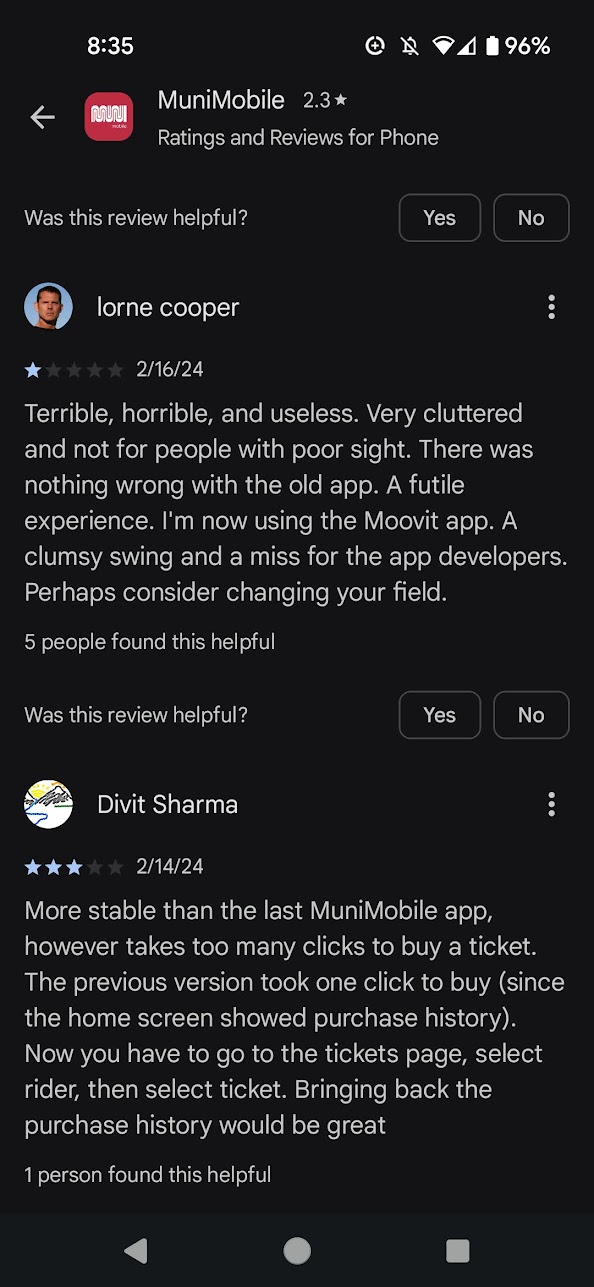
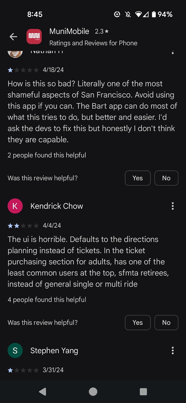
Although most local riders use the Clipper Card to get around, the Muni Mobile app is an alternate option for buying different types of tickets, planning trips, and viewing general transit information. In the beginning of 2024 Muni sunsetted its old app and launched a new one in promise of fixing its notoriously frustrating predecessor, but to similarly negative reviews.
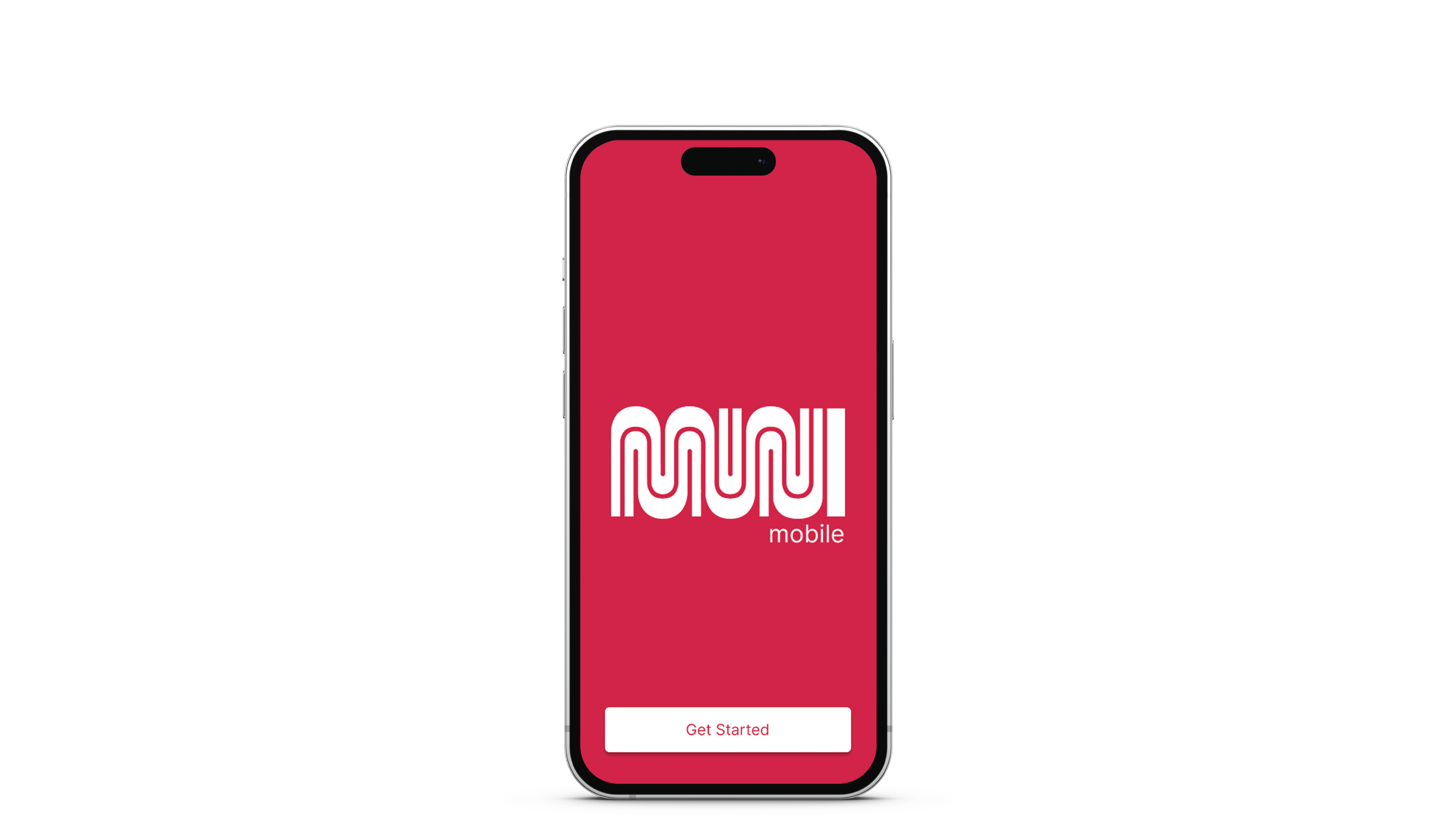
For this project, the refreshed design is intended to have a more modern look integrating a seamless ticket purchasing and usage flow, as well as provide a new onboarding experience to help first time users.
I started by combing the reviews to investigate common pain points and patterns.
Technical issues aside, these were some of the recurring themes:
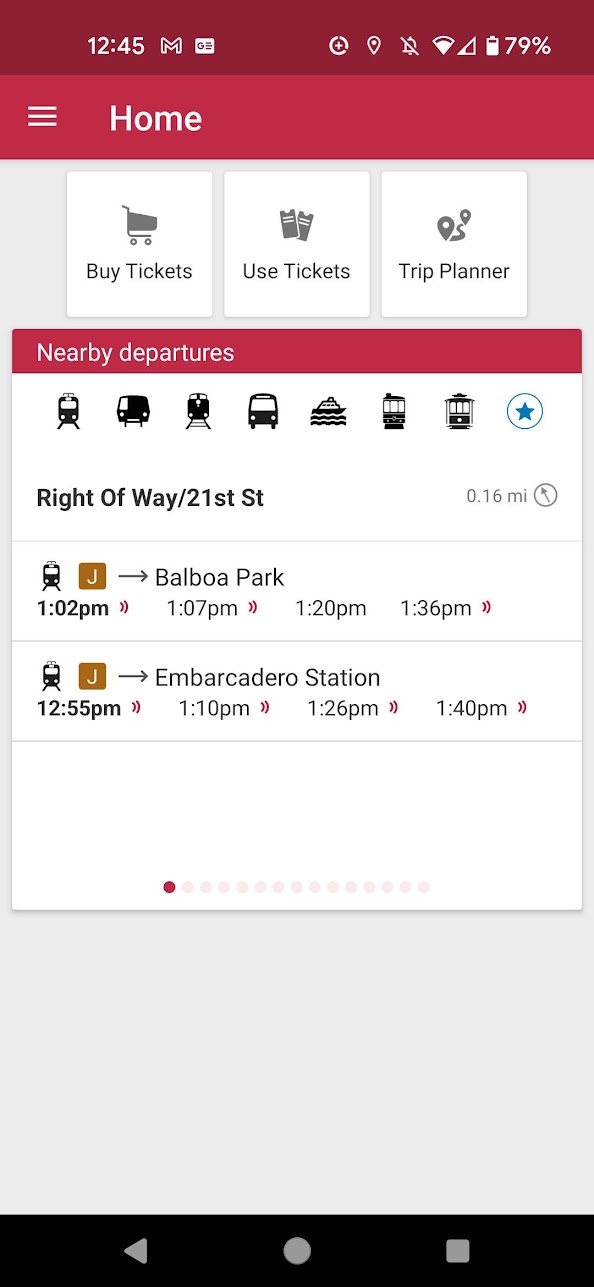
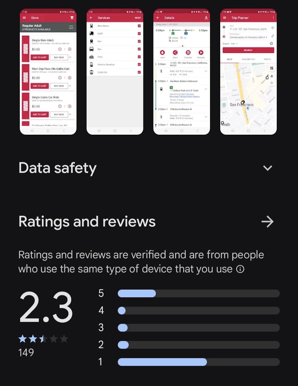
The home screen of the app, which is dominated by the indecipherable trip planner tool. Even the most seasoned San Franciscan would have trouble identifying these icons - many of which are not part of the Muni system
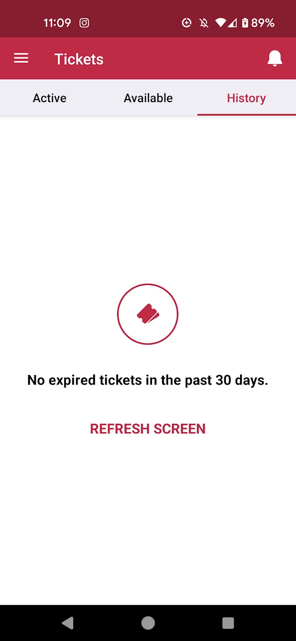
The 'Use Tickets' page - the difference between 'Active' and 'Available' tickets is unclear. In addition, the app requires manually hitting the refresh screen button to see new tickets. History also doesn't let you repurchase old tickets.
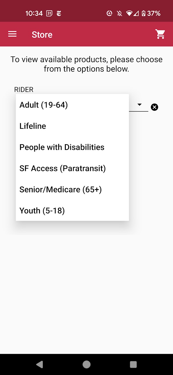
For purchasing a ticket, you first have to select the type of ticket and then wait for the next screen to load all the tickets. There's no way to 'favorite' tickets or see most recently purchased.
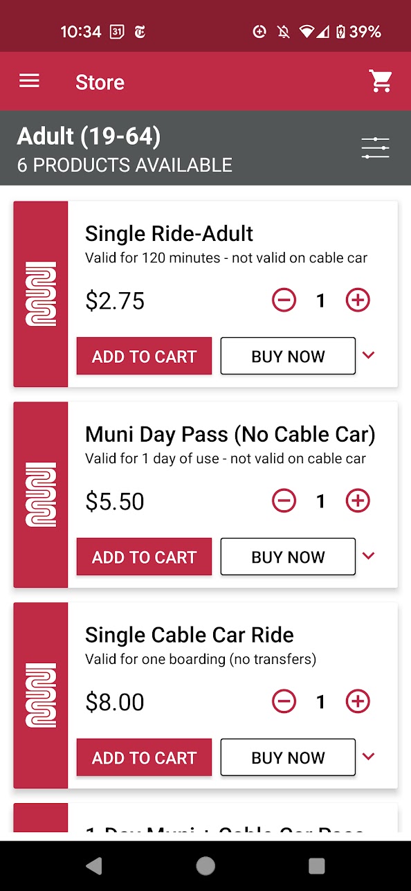
You aren't able to see any of the other ticket types once you select from the dropdown. Not to mention the distracting Muni worm logo on each listing.
The overarching sentiment was that most users prioritized efficiency, accessibility, and clarity, especially regarding the ticketing features.
Based on the reviews, old screens, and user research, the features I prioritized adding an onboarding flow in addition to streamlining the ticket purchasing and viewing experience, in addition to making the branding overall more playful and modern.
For the colors and tone of the app, I stayed consistent with the Muni branding and colors by using its striking and recognizable bold red, combining it with the character of the city's iconic cable cars to create a more levity in its presentation. For accessibility purposes, I maintained high contrast between the text and background since the app would likely be used in all lighting scenarios.
Since the vast majority of locals are most familiar with and use the Clipper card to get around, many of the app's users are often first time visitors from out of town. Thus, I wanted to create a simple onboarding flow to make Muni Mobile more accessible and approachable.
I initially experimented with creating a flow based on questions - such as asking if it was their first time in San Francisco and how long they planned to stay for. The intention behind this was to surface guidance for travel - for example, that Muni offers multiple more cost-effective day passes that might not be known to visitors.
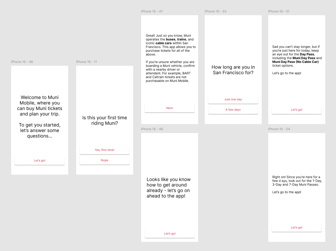 An early prototype of the onboarding screen involving questions to give the user a more tailored experience
However, after mapping it out it felt like it was a lot of unnecessary screens and long paragraphs that would quickly be skipped. The information, while important, could just as easily been highlighted or made obvious through the app itself.
After researching existing onboarding experiences, I decided to go with a simple flow highlighting the purpose of the app, as well as provide a rudimentary tutorial for navigating the application.
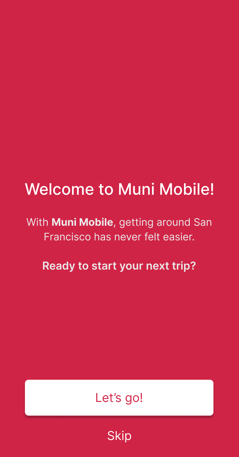
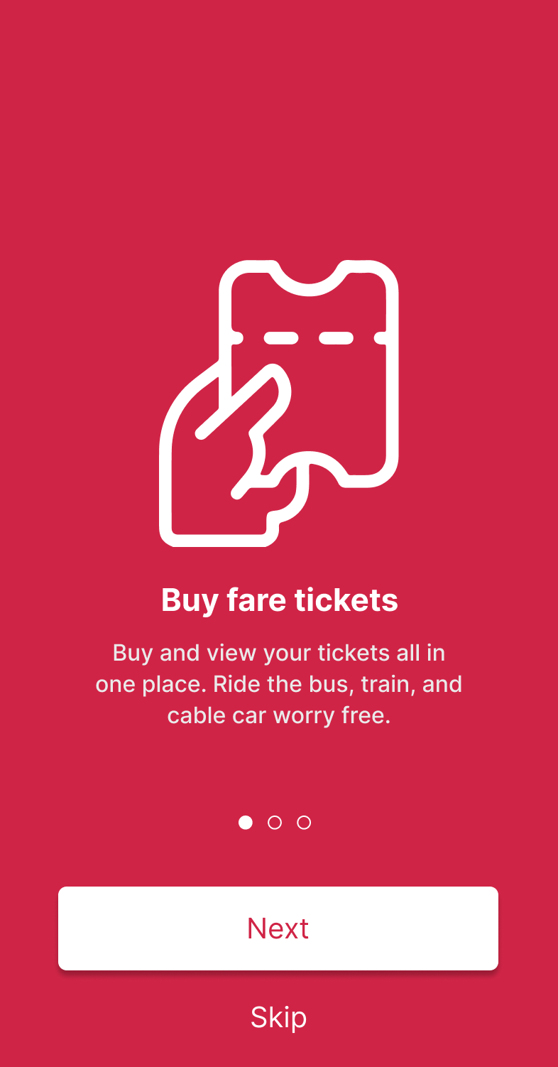
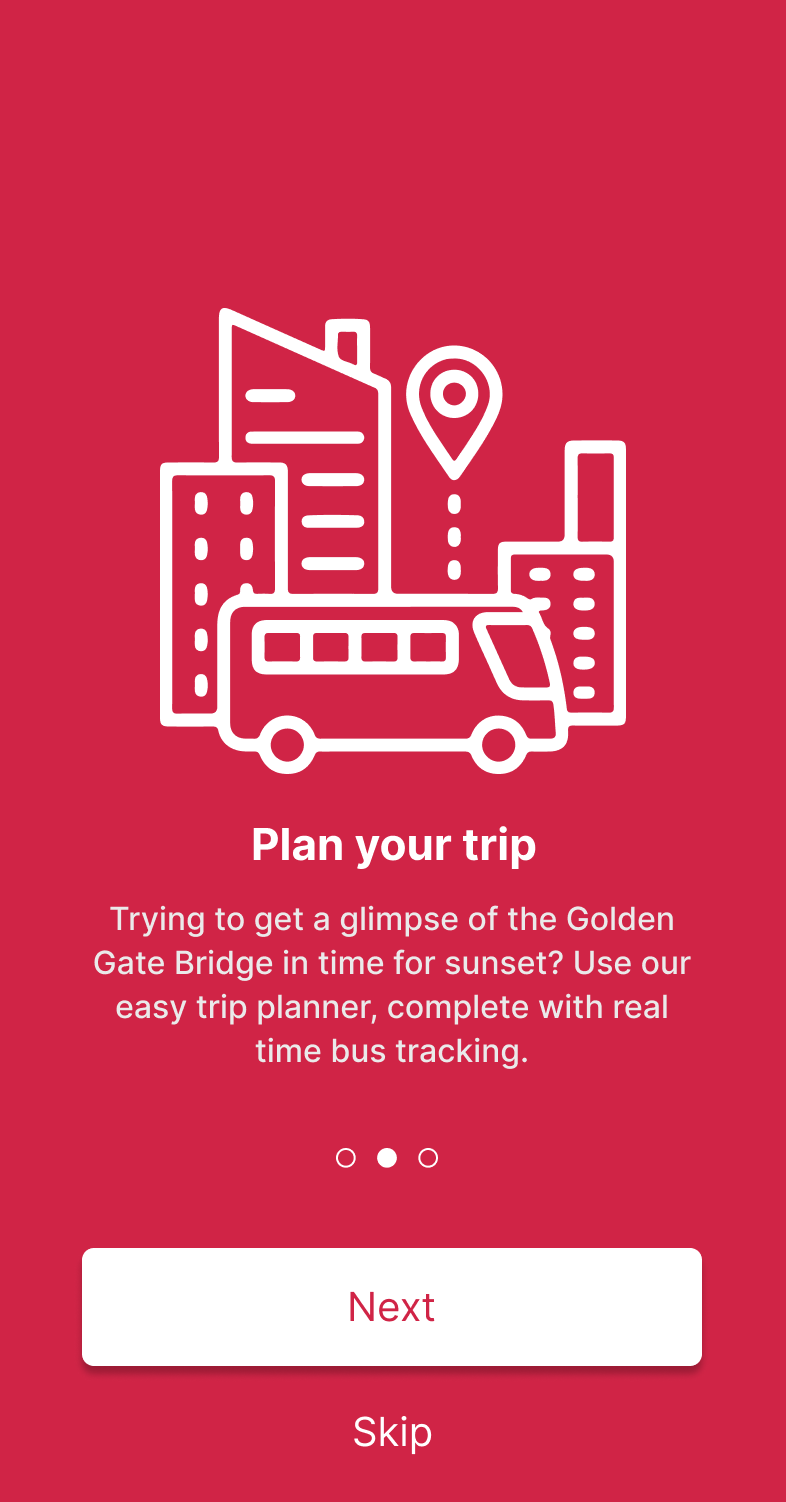
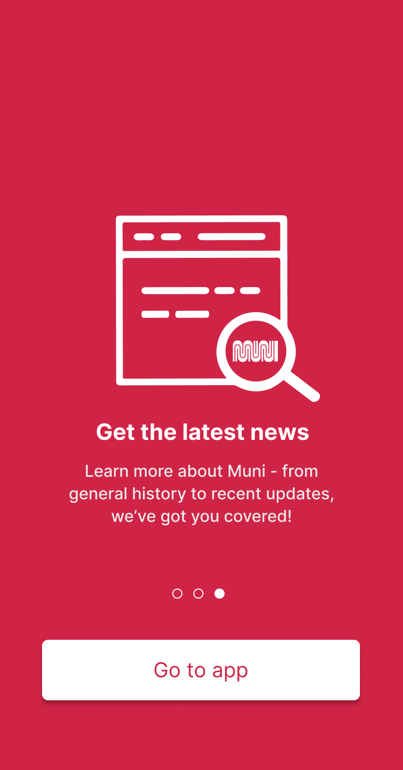
The onboarding flow is followed up with a light tutorial to quickly direct the user towards the features just highlighted.
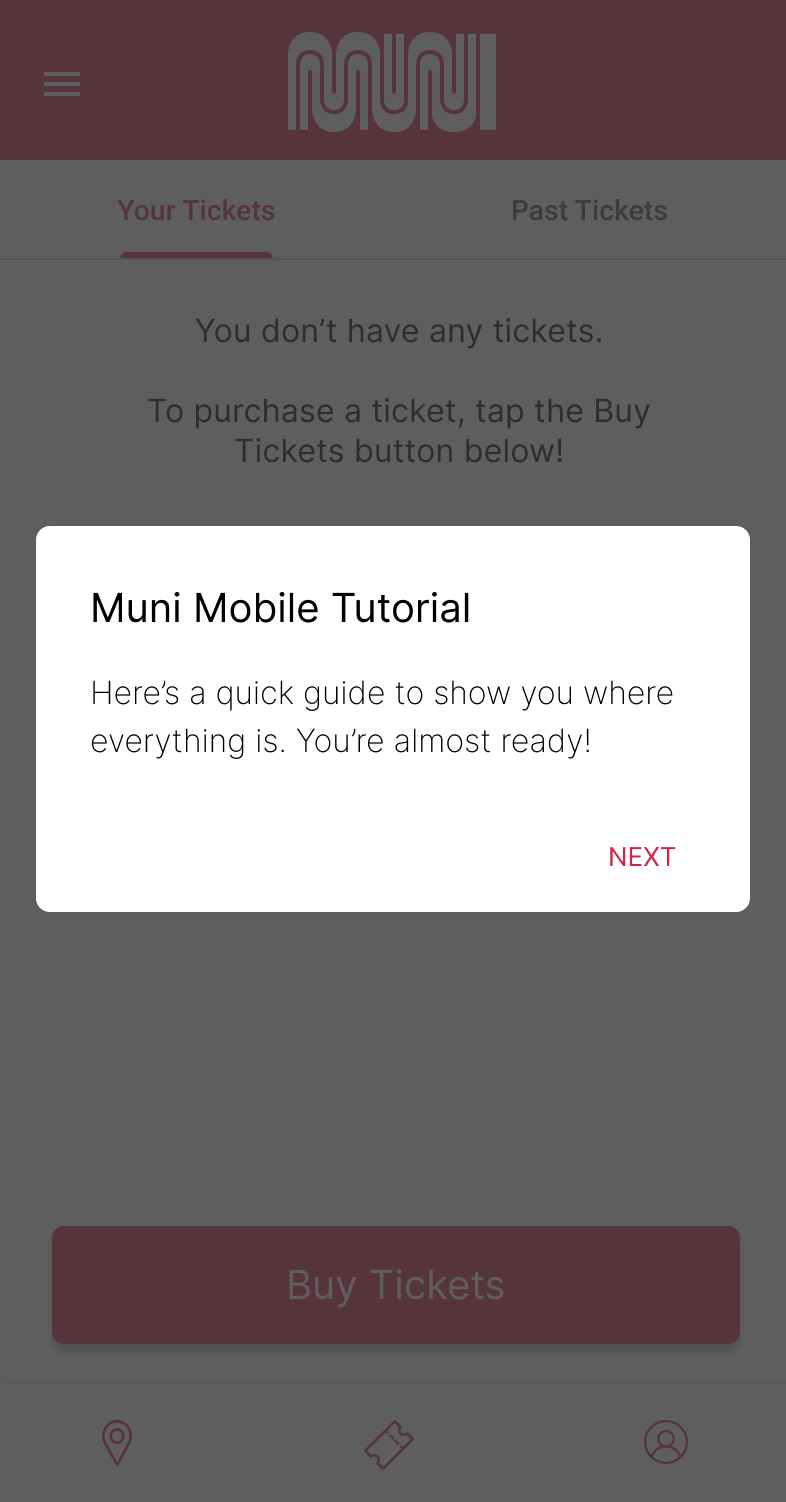
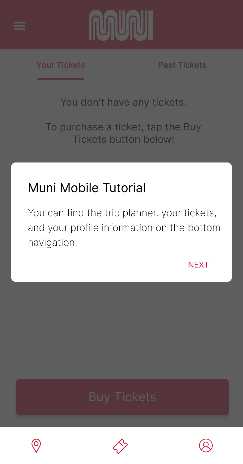
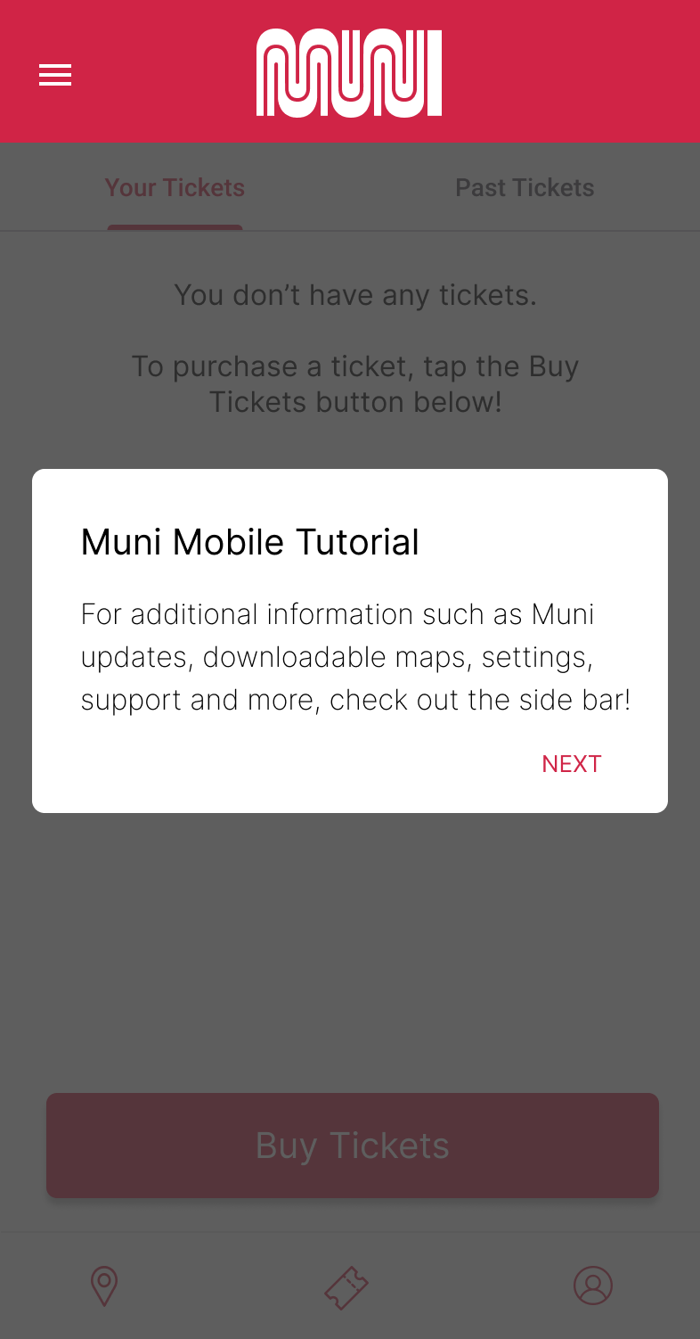
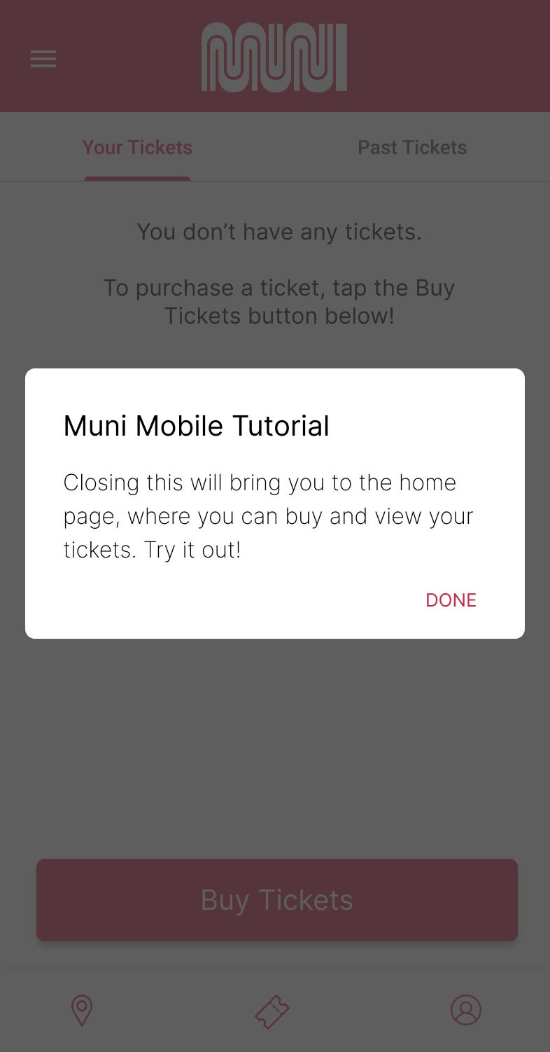
As a way to ease in new users, a low information dense onboarding and tutorial flow reduces the barrier to entry.
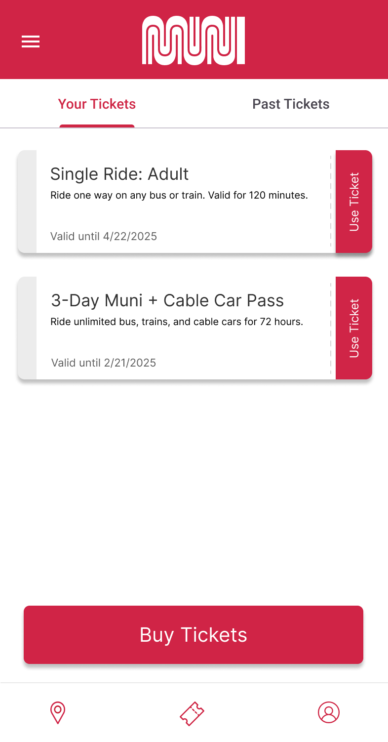
As the majority of users of the Muni Mobile app were using it for its ticketing feature, I prioritized making the task of browsing, viewing, and activating tickets as seamless as possible.
In some early iterations below, I tried out different configurations for the best way to display the
tickets while making
the distinction between
how to buy tickets, view current active tickets, inactive tickets, ticket history obvious.
Differentiating the inactive vs active tickets was important - once a user buys a ticket, it needs
to be activated in order to be used.
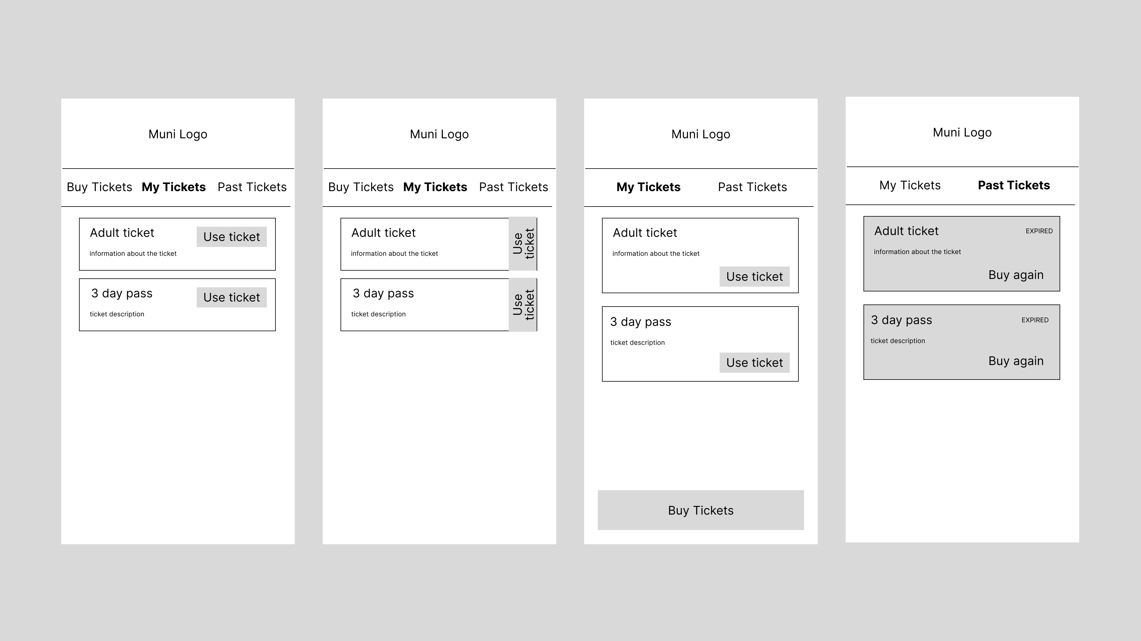
I combined elements of these early prototypes, such as separating out the Buy Tickets into its own button, increasing the size of the ticket for readability, and placing the use/view ticket button on the side of the ticket to be akin to 'tearing' the ticket and increasing space for information.
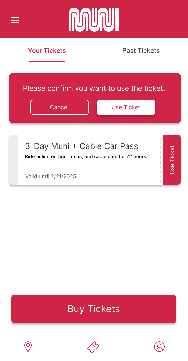
Since 'Use Ticket' is an irreversible action with a time expiration, the pop up ensures there is an additional action before committing. It also guards against accidentally hitting the button while scrolling.
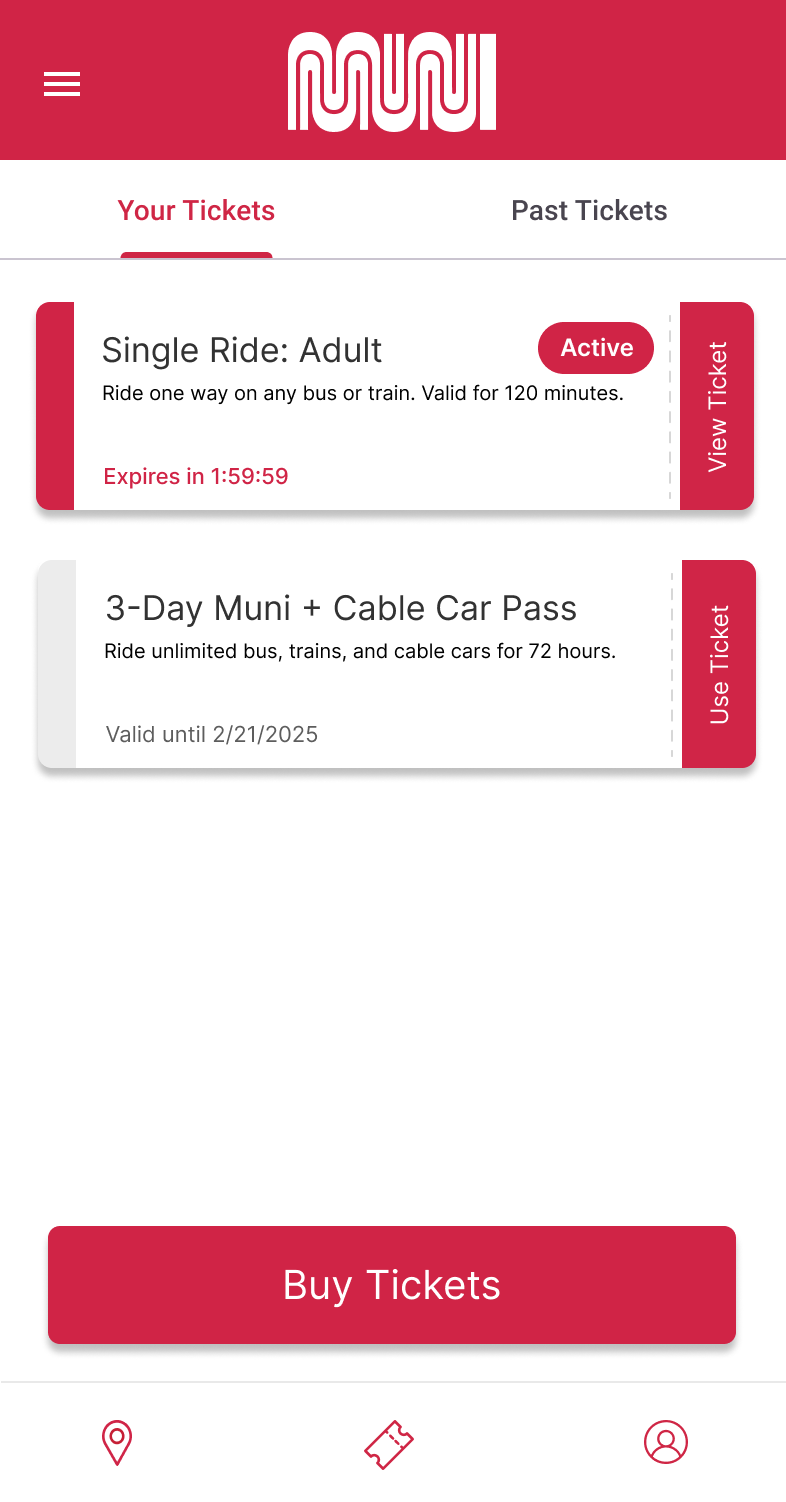
After the activation of the ticket, the ticket becomes 'Active', denoted by the Active pill as well as the red color on the left of the stub. The action 'Use Ticket' also changes to 'View Ticket', and there is an active expiration countdown timer.
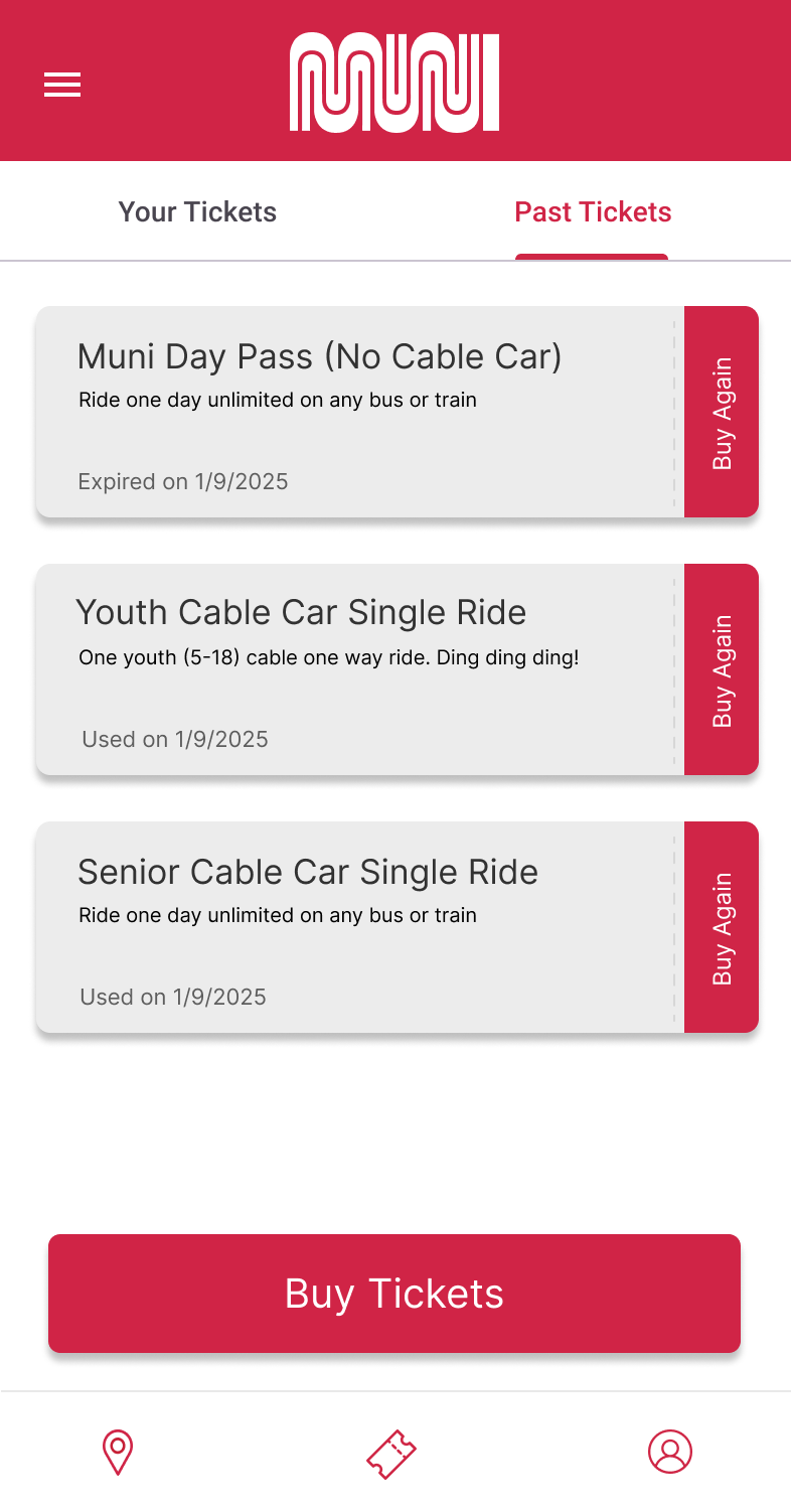
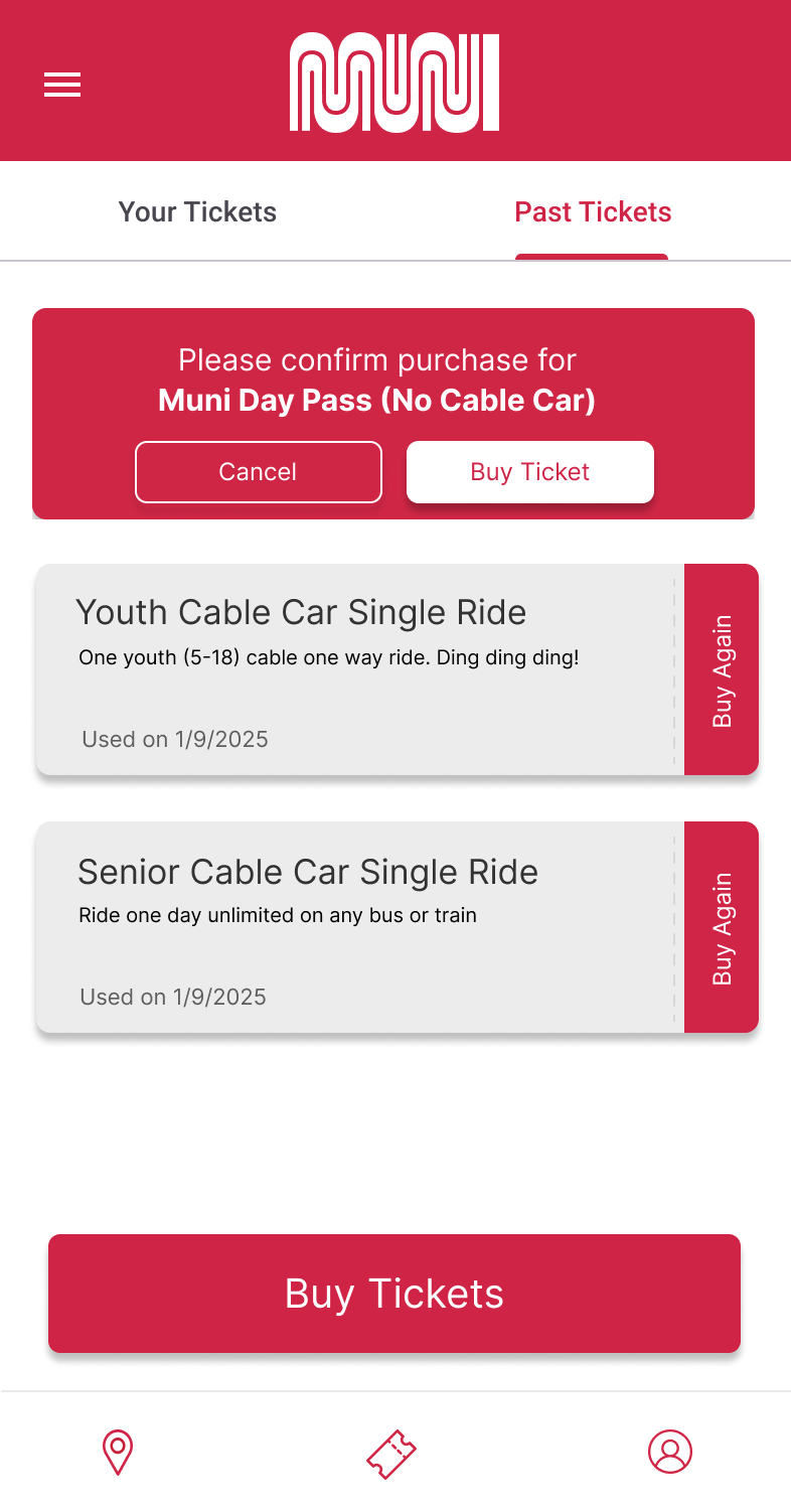
For viewing past tickets, many users noted that past tickets were not purchasable, a feature which was popular in the previous iteration of the app. Here I integrated a quick buy feature from old tickets, which takes fewer steps than the default checkout flow. Past tickets are greyed out while retaining the action to buy, and also shows if the ticket was 'Used' or 'Expired'
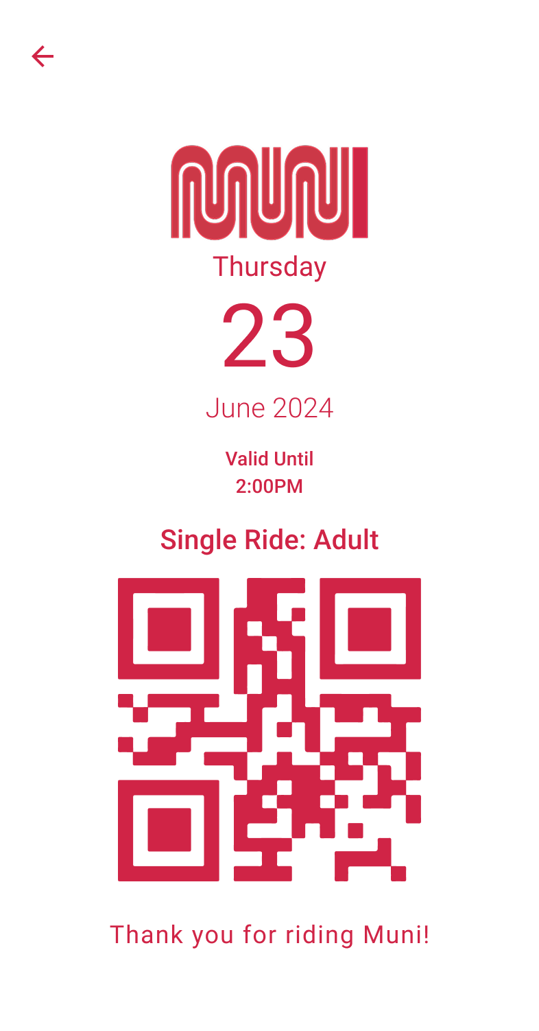
Using the ticket brings you to the ticketing QR code, which is loosely based on existing old school Muni ticket stubs. The screen prioritizes maximum contrast so that it can be easily scanned by fare enforcement or used in all lighting environments.
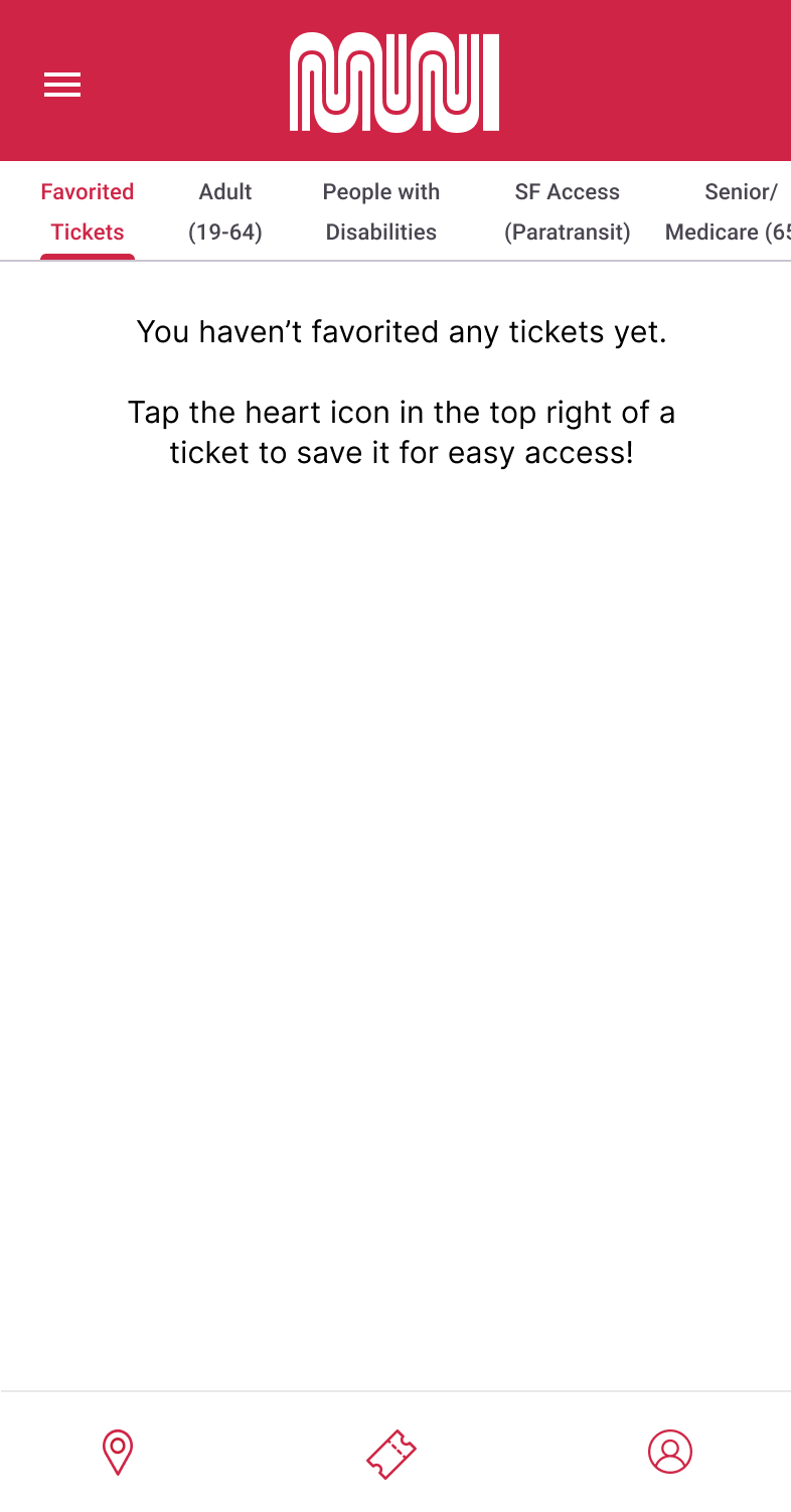
For the ticket purchasing flow, thea 'Favorite Tickets' feature was added for easy access to most the user's commonly used tickets. I also gave each ticket type its own tab to simplify viewing the catalog.
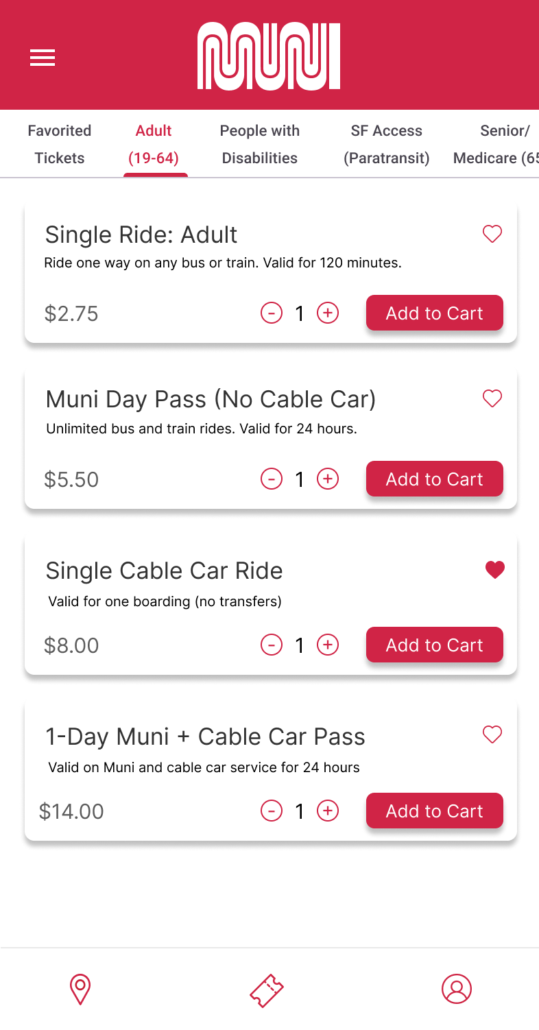
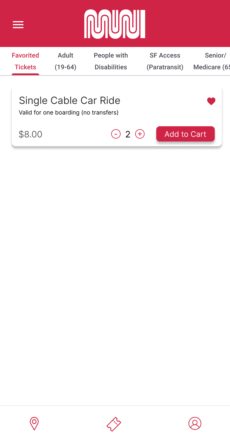
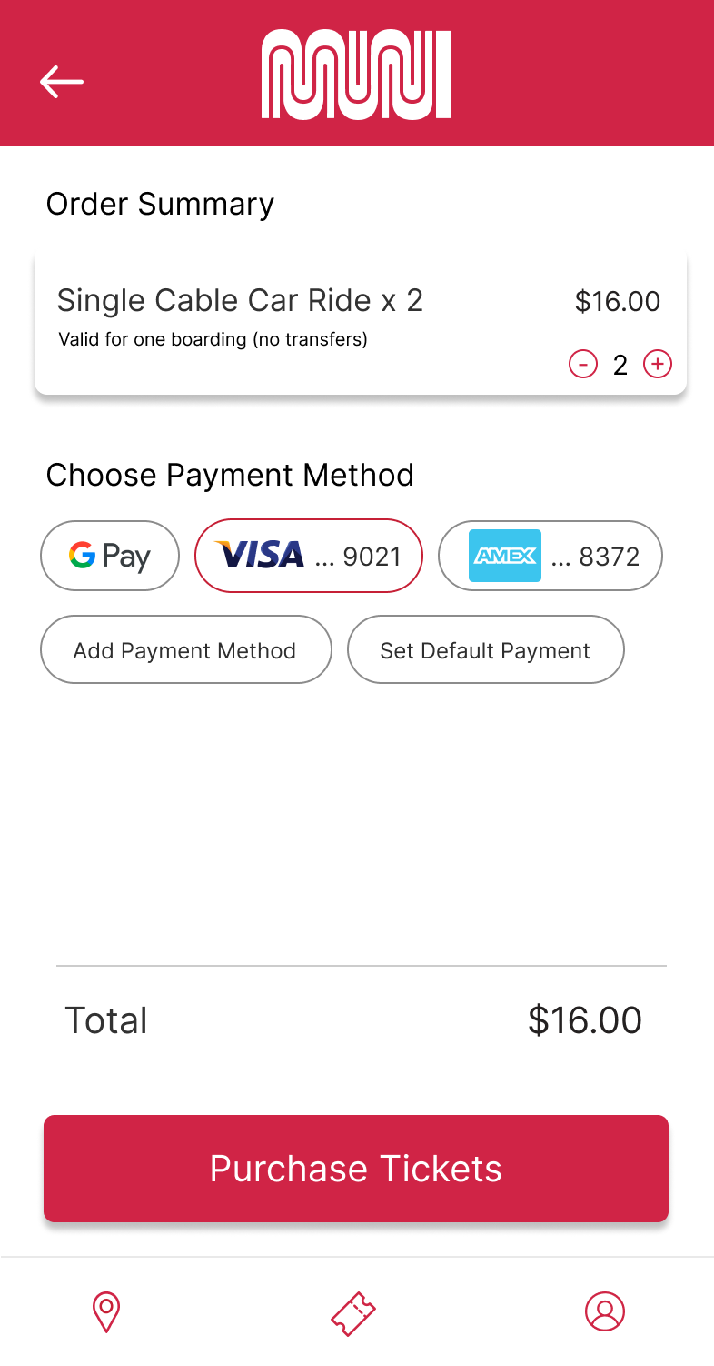
Only after adding to cart does the 'View Cart' button with the number of tickets and price show up - from there the payment flow defaults to your selected payment and confirms your tickets went through.

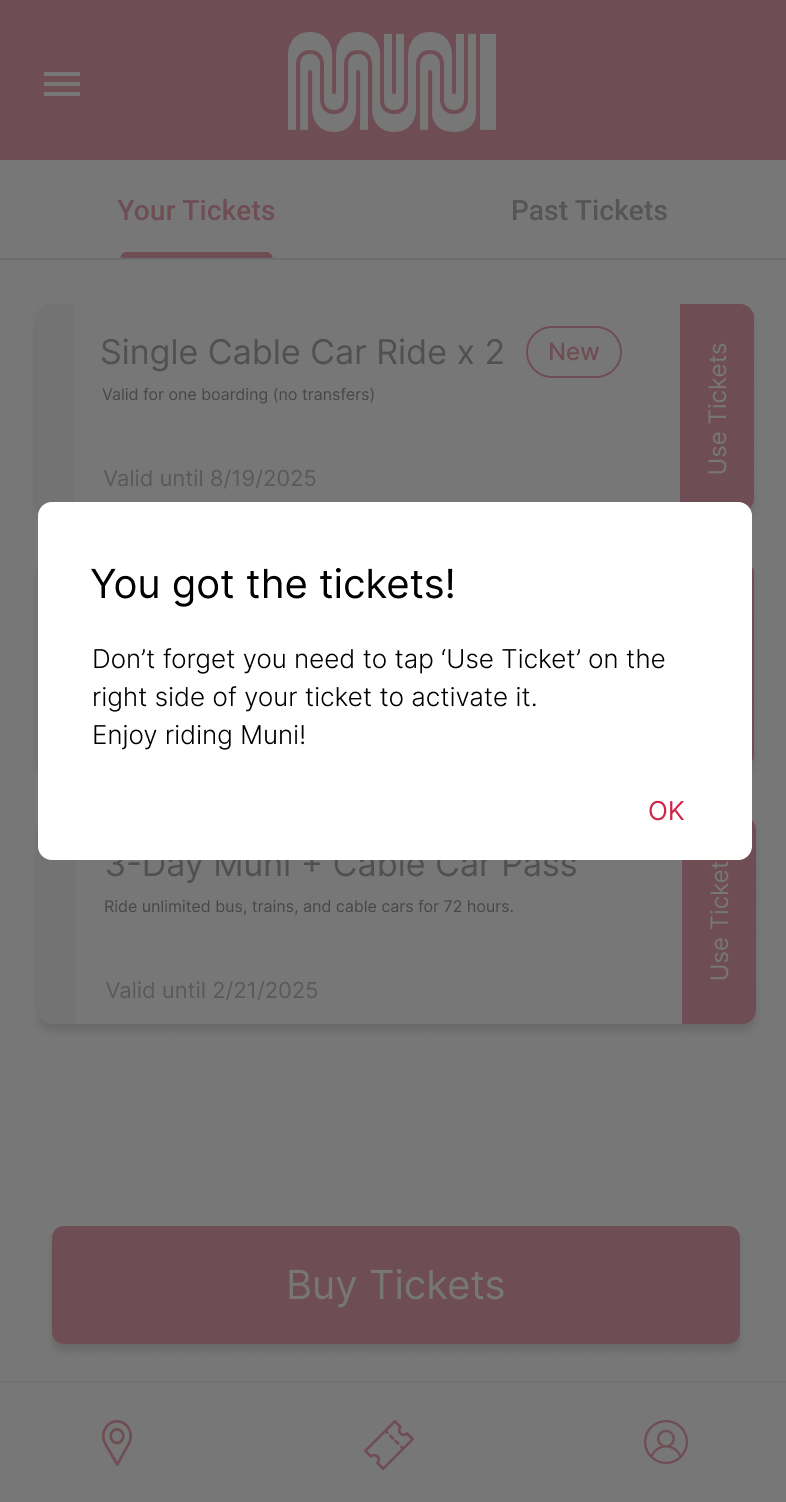
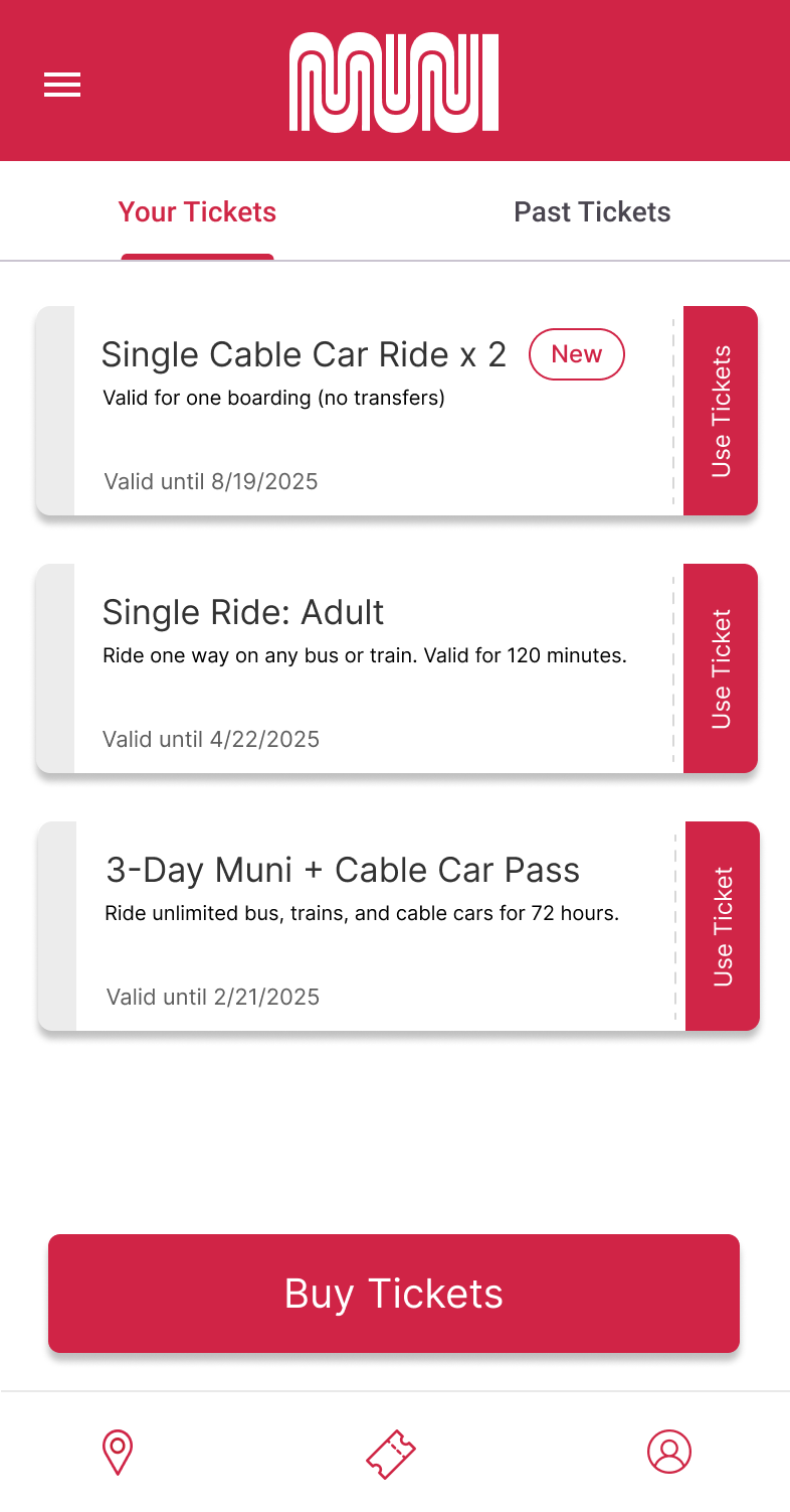
Purchasing the tickets navigates you back to Your Tickets, where the 'New' pill highlights its recent purchase.
Overall it was a challenge translate a deceptively complicated flows into an experience that was easy to understand - ticketing, for example, had a lot of nuances regarding activation and viewing that would be complicated to new users of the system. In the end, focusing on clarity and signaling of new states through color and animation really helped differentiate parts of the process.
Further improvements would involve tackling the trip planning tool, which is clunky enough where I would recommend users just switch to Google Maps for. I would also have liked to play more with settings regarding accessibility (such as increasing font size), and maybe exploring how to further consolidate the ticket purchasing options (though that would require some more insight from Muni ridership statistics).
If the project had a bit more scope, I would want to play with an alternate onboarding experience that utilizes an AI Muni companion that would answer questions and direct users through flows within the chat system. While adding AI to a relatively small tool might seem like overkill, the near ubiquity of such tools might necessitate exploration down the road.